


Every national color trend guide assumes a kind of light Bellevue rarely sees. Those guides get shot in bright studios under strong sun, then reused everywhere, including here in the Pacific Northwest.
That gap is exactly why interior paint color trends Pacific Northwest homeowners need look different from national design roundups. From October through March, Seattle and Bellevue see long stretches of soft, gray daylight, and that changes how nearly every color reads on a wall.
This guide breaks down which interior paint colors Seattle homes handle best, room by room, plus a simple framework for picking a color that still looks right in February.
Why Does Pacific Northwest Light Change How Paint Colors Look?
Pacific Northwest light is diffused and cool rather than direct, which changes how paint colors read compared to sunnier climates. A color that looks crisp under strong sun can turn flat or clinical under Seattle's cloud cover.
This happens because color depends on how much light is available to bounce off the wall. Bright sun pulls out warmth even from a neutral color, while soft, indirect daylight exposes cool undertones barely visible on the paint chip.
That is the whole reason interior color trends Seattle Bellevue homeowners follow look different from a national trend report. A color that reads warm in a sunny Phoenix living room can read sterile in a Bellevue one under the exact same paint code.
Getting paint colors for overcast light right starts with understanding undertones first. A warm undertone acts like insurance for a room that spends half the year under cloud cover.
💡 Pro Tip: Always look at a paint sample on the actual wall, in the actual room, at different times of day. A swatch under store lighting rarely matches how it will look on a gray Tuesday in January.
Warm and Soft Neutrals: The Dominant Interior Paint Colors Seattle Homeowners Choose
Warm neutrals are the most reliable starting point for interior paint colors for PNW homes. Warm whites like Alabaster (SW 7008), soft creams, and greige tones create a flexible palette of soft neutrals that holds its character even in limited daylight, since yellow or red undertones keep a wall from reading cold.
Pure White is a popular classic neutral, Accessible Beige offers a cozy, warm alternative to gray, Balanced Beige (SW 7037) is a versatile greige that can complement different home style directions, and Creamy is a soft, warm white that reads inviting rather than stark.
Cool whites and blue based grays look their best under bright, natural light. In a Bellevue home with more overcast days than sunny ones, those same cool whites can look sterile, especially in a room with fewer windows.
Why warm neutrals hold up better in gray-day light:
- Warm undertones add visual depth even when a room gets limited direct sun
- They pair naturally with wood trim, cabinetry, and selected fixtures common in PNW homes
- They photograph and show well in both real estate listings and everyday living
If you are weighing an exterior refresh alongside your interior colors, our PNW exterior paint guide covers which exterior popular paint colors and products hold up best under the same gray skies.
Warm Mid-Tones That Actually Work in Low-Light PNW Rooms
Beyond neutrals, a handful of warm handsome midtones consistently perform well in Pacific Northwest interiors. The common thread is a warm undertone that keeps the color from turning muddy under soft daylight.
Warm interior paint colors Seattle homeowners keep coming back to: Earthy hues will continue trending into 2026, and this part of the market sits between warm creamy neutrals and moodier blue-grays.
- Terracotta like Rookwood Terra Cotta (SW 2803), which brings warmth to a dining room or entryway without feeling overly bold, especially alongside clay tones and even burnt sienna
- Sage green like Sage (SW 2860), a soft, grounded green that reads calm rather than cold in low light; earthy greens remain a leading interior trend and create a calm connection to nature
- Dusty rose like Dusty Pink (SW 2284), a muted pink with enough warmth to avoid looking washed out
- Warm ochre like Earthy Ochre (SW 9532), a rich, golden yellow that adds energy without feeling harsh, with mustard yellow offering a related note rooted in nature-inspired warmth
Deep rust and soft browns help bring a calming feel to low-light rooms.
Cool mid-tones in the same color families, like a true blue-green or a cool lavender, tend to read flat and lifeless in the same rooms. The warm undertone is what makes the difference, which is why these four rank among the most dependable paint colors for low light rooms across the Eastside.
Dark, Moody Colors Done Right for Bellevue Homes
Dark, saturated colors can work beautifully in a Pacific Northwest house, even though the instinct is to avoid them when light is already limited. Done well, a moody color palette of forest green, deep navy like Naval (SW 6244), and warm charcoal like Iron Ore (SW 7069) is predicted to remain popular colors through 2026 and can create a sense of dramatic that light colors cannot always deliver on a gray day.
The key is placement and room size. A small, well-lit dining room or a bedroom without much daylight can handle a deep, saturated color and feel intentional rather than dim. A large, naturally dark room with few windows is a tougher fit, since the same color can feel like a lack of light rather than a design choice.
Pairing a dark wall with warm lighting, natural wood tones, and a few lighter accents or other colors keeps the room from feeling closed in and adds balance. This is also where a well-placed accent wall shines, and our guide to accent wall painting in Bellevue covers color drenching and color blocking techniques that pair naturally with these deeper, moodier shades. You can browse real Bellevue examples in our project gallery, where several dark accent walls sit alongside lighter trim and furniture.
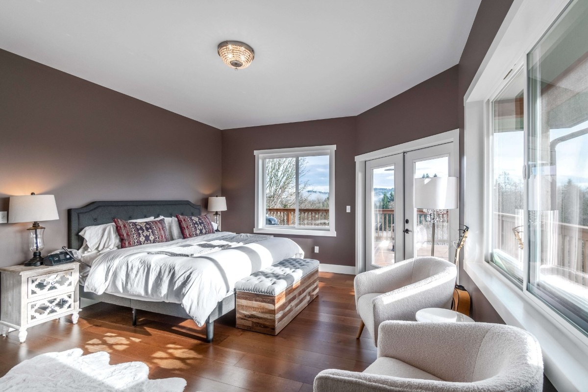
Warm Neutrals vs Cool Neutrals in Pacific Northwest Light
Neither option is universally right or wrong. Industry professionals generally recommend leaning warm in rooms with limited light, and saving cool neutrals for spaces that already get strong sun through large windows.
What Is the Best Paint Color for a North-Facing Room?
North-facing rooms get the least direct sun of any exposure, so a color that looks warm in the store can read neutral, or even cool, on that wall. The fix is a simple adjustment most professional painters use.
A quick decision framework for north-facing or tree-shaded rooms:
- Pick a color that already reads warm on the chip, not one that looks neutral in the store.
- Go about 20 percent warmer than your instinct suggests. What reads warm on a sample card often reads neutral on a north-facing wall in February.
- Test a large sample on the wall, not just a small chip, and view it morning, midday, and evening.
- Avoid cool blues and true grays unless the space also gets strong light from an east or west facing window.
If you want a second opinion on a specific room, our team can talk through your room's light and undertones before you commit to a color.
Sherwin-Williams Color Trends and What They Mean for Pacific Northwest Homes
Sherwin-Williams color trends Seattle designers are watching this year lean toward warm, earthy neutrals, and that direction translates especially well to Pacific Northwest homes. The current Sherwin-Williams color of the year is Universal Khaki, a warm, midtone neutral built around gentle, livable warmth rather than bold contrast.
For a concise contrast, Benjamin Moore's Color of the Year 2026 is Silhouette AF-655, which readers can discover as a moody direction that reflects evolving color psychology and consumer tastes. If you want something lighter than earthy neutrals or moody shades, soft pastels like dusty rose and muted violet also appear in the 2026 trend palettes.
That kind of warm, grounded neutral is a strong match for Bellevue and Seattle interiors, since it holds its character through the gray months instead of fading into the walls. Sherwin-Williams colors Pacific Northwest homeowners gravitate toward share that same warm, earthy quality, whether it is a wall color, a trim shade, or an accent tone.
💡 Pro Tip: When comparing Sherwin-Williams color trends Seattle homeowners are considering, ask to see samples under your home's actual lighting rather than an in-store display.
Best Interior Paint Colors by Room
Finding the best interior paint colors Pacific Northwest light supports means taking a different approach for nearly every room.
Bedrooms generally do best with quieter, earthier tones, since the goal is a calm space rather than a bold statement. Cool blues can work in an east-facing bedroom with strong morning light, but they tend to read cold in a room without much direct sun.
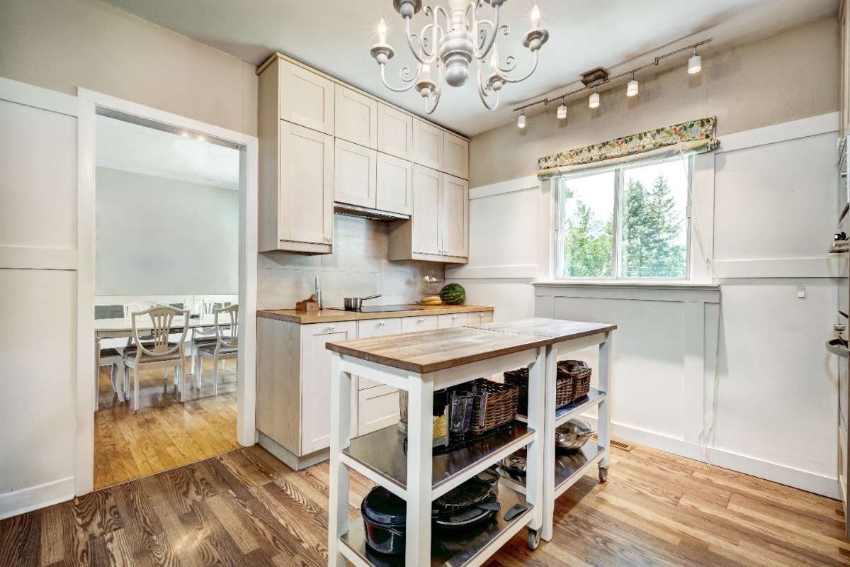
Living rooms benefit from a warm anchor color on one wall, paired with lighter walls nearby to create depth rather than a single flat box of color. Kitchens perform better with warm whites or creamy off-whites, which outperform cool grays under the soft daylight most Pacific Northwest kitchens get.
Once you have a color in mind, our paint sheen guide by room matters just as much, since sheen affects how much that color reflects the room's available light.
Common Paint Color Mistakes in Pacific Northwest Light
A few recurring mistakes show up in Bellevue color choices, and avoiding them saves a repaint later.
- Trusting a small paint chip over a wall sample. Chips under store lighting rarely match a north-facing wall in real life.
- Choosing a trendy cool gray without testing it at home. Many cool grays that work nationally read flat under PNW light.
- Ignoring the room's exposure. A color that works in a sunny south-facing room may not work the same way in a shaded one.
- Painting a small, dark room in a deep color without extra warm lighting. The room can end up feeling dim instead of cozy.
- Skipping a real sample test period. Live with a sample for a few days across different weather before committing.
Why Work With a Local Painter on Your Color Selection
Choosing a color that works in Pacific Northwest light takes more than a favorite shade from a magazine. A local painter working in Bellevue homes every week already knows how specific colors behave in this light, room by room.
HELLO Painting works with homeowners on color selection as part of every interior project, not as a separate add-on. Staying current on Sherwin-Williams color trends Seattle homeowners ask about, along with broader interior color trends Seattle Bellevue clients follow, is part of everyday work for a local painter.
Our interior painting services in Bellevue include full color consultation, and if you are also weighing overall project costs, our interior painting cost guide breaks down what a typical Bellevue interior project runs.
Bringing the Right Color to Your Bellevue Home
Picking a color from a national trend list rarely accounts for the light your Bellevue home actually gets. Interior paint color trends Pacific Northwest homeowners can rely on start with warm undertones, then adjust room by room for exposure, size, and season.
Interior color trends Bellevue homeowners search for tend to follow this same warm, PNW-first approach, whether the goal is a full repaint or a single accent wall. The team at HELLO Painting can help you turn any of these ideas into a finished room that still looks right in February, not just on moving day.
HELLO Painting offers access to the full Sherwin-Williams color library, and you can schedule a color consultation with Sherwin-Williams support to compare options in your own space.
FAQs
What are the best interior paint colors for Pacific Northwest homes?
Warm neutrals, warm mid-tones like terracotta or sage green, and well-placed dark colors perform well, since warm undertones resist turning flat.
Do cool paint colors work in Seattle homes?
Cool colors work best in bright, direct light, like south or west facing rooms. With less sun, they read flatter than sunnier climates.
What color should I paint a north-facing room?
Choose a color that reads warm on the chip, then lean warmer, since chip-warm often reads neutral on a north wall.
Is Universal Khaki a good color for Pacific Northwest homes?
Universal Khaki, the current Sherwin-Williams color of the year, is a warm, midtone neutral that performs well here, avoiding the flat look common in low sun.
What paint colors work best in a Pacific Northwest kitchen?
Warm whites and creamy off-whites outperform cool grays in PNW kitchens, keeping the space feeling bright, not sterile.
How do I know if a color will look too cold in my home?
Test a large sample on your wall at different times of day, especially an overcast afternoon. A flatter look than the chip means it needs warmth.
.svg%20fill.svg)




.svg)